Gone are the days when functionality used to drive the usage of web applications and any kind of software, developers cared less about what the software looked like. Software was driven mainly by what it does and little by its looks.
However things have changed, technology has evolved and user experience is now taken very seriously. The user has become very important so the software has to look good enough to be used without hassle. Besides, the software is useless without a user.
As the year 2018 progresses, UI designs would continue to improve. So it would be great to have a look at some of the trends we expect UI designs to experience this year.
Fullscreen videos at the peak

In a world where time is precious and almost everyone is trying to soak in a lot of information in a short period, the usage of videos have saved people more time and increased productivity.
In the past, write-ups alone used to be the major means of passing information, then images seemed to be a better option. Right now, videos seem to be better and would be used as a means of passing information on websites this year.
Videos are interactive, extremely dynamic and engaging. They catch the attention of viewers very easily and from the designer‘s angle, they are very beautiful on single page websites.
Gradients are beautiful
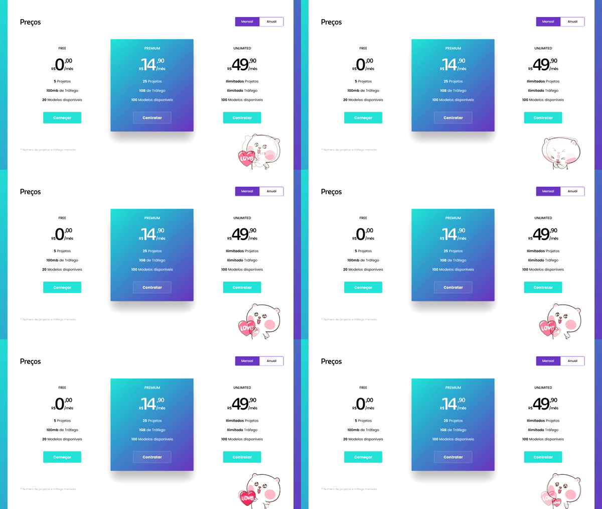
Gradients help create very beautiful designs, and they could be very critical in developing quality user interfaces.
With websites such as Spotify tapping into the potentials of the creating designs with gradients, it shouldn‘t take long before other websites and software begin tapping into it.
Really, not many things are more beautiful than a perfect combination of colours.
2018 would bring about a perfect mix of bright and cool colours, appropriate contrast and mix levels leaving the user wanting more of great designs.
Long forms suck, but they would stay
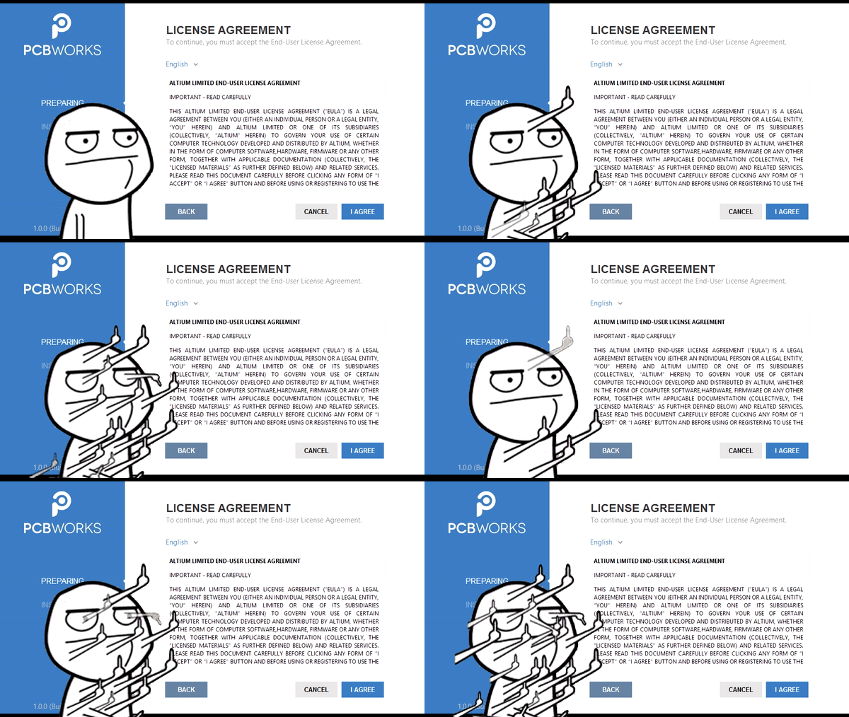
As stated earlier, today‘s users have little or no time to read through thousands of words, so we all skip long content and search for what really matters to us.
Hardly does anyone read the Terms And Conditions or the EULA, all we do is to scroll and search for the accept button to be clicked.
However, sometimes long written content is actually needed. They are needed to pass important information in details and this sort of content leads to unconscious scrolling and neglect of the information in the long form.
In 2018 this issue should be tackled. With new UI designs making headway, a design that takes this into consideration would definitely be appreciated.
This leads us to the next:
Cards are here to stay
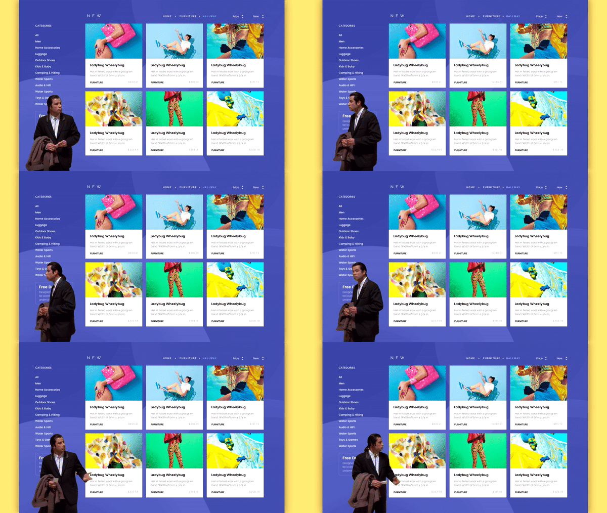
The use of cards in UI designs have gained lots of acceptance ever since its use became popular.
In a world where users would get to access software more from their mobile devices than from their computer screens, the cards design would continue to have a great impact on the user experience.
Looking back at the long form situation, cards could possibly help tackle the issue especially if users are able to swipe through the content like its a pack of cards instead of the traditional scrolling that has to be done on many websites.
Expect more improvement in the card design in 2018, as long as mobile interface remains important, cards would continue to enjoy a high level of acceptance.
Saying our final goodbyes to the grid
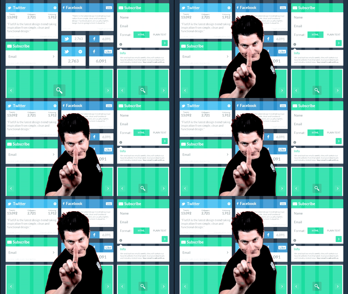
The grid has contributed greatly in the creating of beautiful user interfaces on websites and other software, as it allows for easy navigation.
However, the status quo has definitely been challenged by (you know who) Apple Inc. who have been pushing the acceptance of gridless display.
This has clearly been a good development, as the gridless approach hasn‘t had a negative impact on user experience as feared, and it has also given the designer a better shot at showcasing creativity and unleashing the best of design techniques while developing user interfaces.
Admittedly, the grid still has a huge part to play as it offers consistency and balance to user interfaces, giving users a great onsite experience as it always has.
The bolder the font the better
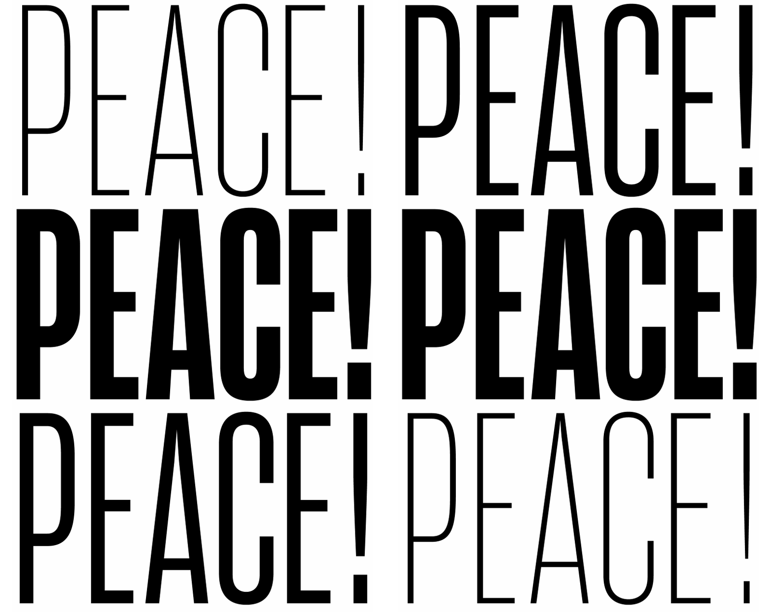
It is no news that typography plays a huge role in creating great user interfaces.
Regardless of content type, be it articles, images or videos, fonts are highly needed as they not just pass information they are also a means of adding beauty to the display.
Since fonts are of this great importance, it would be logical to make them bigger, bolder and beautiful and that‘s exactly what is going to happen as this year progresses.
UI designs would experience bigger typography than before. This development is definitely not totally new to UI designers, as the use of flat design has gained popularity over the last three years and the use of the bigger font is simply an improvement on that design.
Material design remains in the game
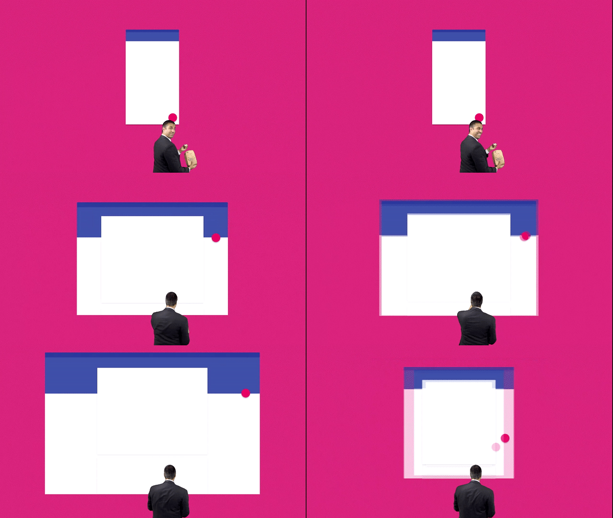
Material design gained popularity about 4 years ago as Google used this design in the Android KitKat user interface. It gained a lot of acceptance due to its simplicity, sharpness, and lightness.
One would expect it to die out soon, considering it has been in and around the UI design environment for over four years.
However, that is not the case. Google is improving on it this year and we all would be waiting to see if it‘s a hot or a miss.
Perhaps then, a material design would gain the tag “Cat with nine lives“.
Virtual reality and augmented reality come into the picture
The rate at which Virtual Reality and Augmented Reality is being used increases daily. With Chief Technology Officers of various companies trying to find ways for their companies to tap into the great potentials of this great technology.
The use of VR and AR is expected to increase this year, so the need to produce great designs for those platforms would experience an increase too.
VR and AR would capture the attention of wider masses and create room for more opportunities for product designers to show their creativity.
Conclusion
In the end, a lot of factors would determine what UI designs would turn out to be popular this year.
So we really can‘t be so sure about what would trend in the end, but one thing that is sure is that a lot of things would be experimented upon and UI designs would definitely experience an improvement in 2018.
With the development of new UI design tools, one can only expect the best to happen in 2018.
